
As part of our ongoing improvements to Gallery, we’re releasing major improvements to the mobile presentation of our most popular template, Marquee. The Gallery team has done extensive QA on these changes, but we encourage all customers to review their sites on both mobile and desktop browsers before releasing these changes to their audiences.
Here’s what you can expect from the upgrade.
Improved Navigation and Search for Sites with Custom Headers
For sites using custom headers, we’ve moved navigation to sit beneath the overall site header, within an area that’s accessible by pressing “BROWSE AND SEARCH VIDEOS.” The image below shows what you can expect.

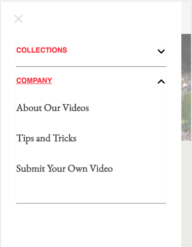
Improved Navigation and Search for Sites Using the Default Header
For sites that use Gallery’s built-in site header, we’ve added a “hamburger” menu that contains both browse and search capabilities.

Improved Presentation of Header Links
When using the default header, we’ve added prominent links to header items. This should make navigating your site far easier.
“Load More” Replaces Pagination on Mobile
Prior to this update, Marquee required customers to page through categories with more than 15 videos. This worked well on desktop, but was awkward on phones. We’ve changed this behavior. Now, to load additional videos, users will press the “Load More” button. The button will then disappear, and new videos will appear below the space where the button had been.

Updating Your Template
To use these new mobile features, you’ll need to re-publish your site. Please make sure to use the preview feature to ensure that the changes look good on all devices that matter to your audience. This is especially important for Gallery owners who have any custom CSS or Javascript in their site.
Enjoy the upgrade. The entire Gallery team is really proud of these improvements!