At the beginning of 2017 the in-house digital team behind the successful video on demand brand UKTV Play embarked on a series of projects to collect and exploit user data. Initially, the key requirement was to develop a different way of segmenting users to drive targeted advertising. Previously digital advertising was partly targeted by interest group - easily determined by the type of TV show and channel the advertising was appearing alongside. But that was set to change to segments relating to household social grade and family make-up, so more data was needed to work that out.
The first and most crucial step was to develop a single sign-on system to be rolled out across all apps, including web, mobile and TV. This allows users to be identified on whichever screen they’re using and their usage patterns to be collected for analysis and personalization. The team’s focus from a design perspective was on developing the best possible experience for TV screen apps as they present the most challenges and, compared to web and mobile, are least familiar to users.
UKTV concentrated on four aspects during the design phase:
-
Users: More specifically, the wide spectrum of users that would have access to one of our TV apps. We speculated that some users would be older and less tech savvy than we normally see for other screen types, everyone watches TV but not everyone uses tablets and laptops.
-
Devices: Interactive TV services can be accessed in many places through lots of different devices. From smart TVs to media streamers to set-top boxes, they all vary widely in their capabilities and ways that users interact with them. It was therefore important to us that a single design would work well and be understandable across all devices.
-
User expectations: Mindful that asking users to register on TV for a free on-demand service would be unfamiliar, we crafted simple and effective messaging to reduce any element of surprise when the registration screen appeared after browsing and selecting a show to watch.
-
Practical considerations: From having to complete part of the process on a different device to navigating complex forms on the TV using a remote control, we understood that usability extended far beyond the app screen designs we were creating.
For user testing, we wanted to put our prototypes in front of real people across a realistic cross-section of our audience. We recruited older, more traditional TV viewers as well as younger viewers in London and Sheffield, and asked them to complete our three proposed routes. The results were fascinating, and some confusions and misunderstandings were observed and acted upon.
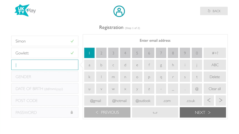
One of the prototypes required users to complete the full registration process by filling out all the forms on the TV screen. As you can see from the design it feels complicated and long-winded. Some users were confused by the ‘next’ and ‘previous’ buttons and how they differed from the left and right arrow buttons. The ‘back’ button added further potential confusion. One user didn’t understand the icon on the space button, another didn’t understand the function of the ‘ABC’ button, which switches keys to upper case, and many complained about the low color contrast of the buttons.
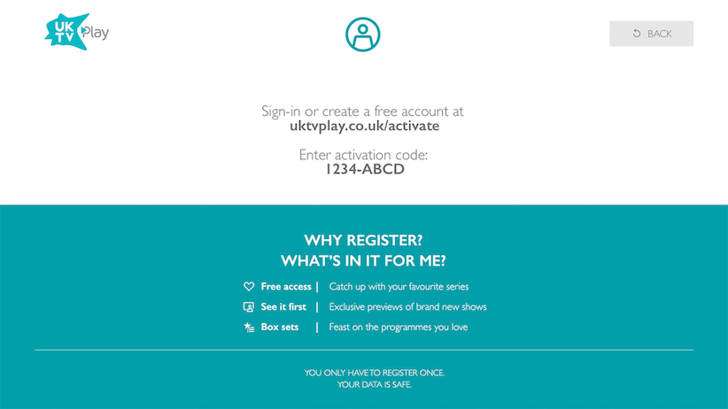
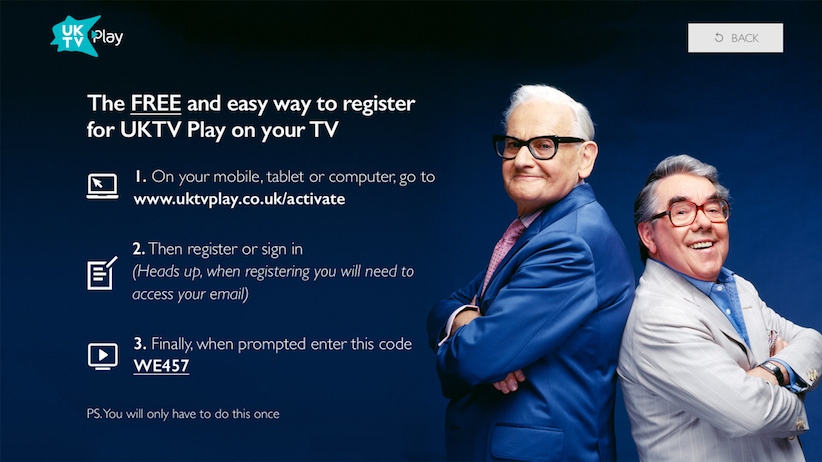
On another of the prototypes users register on a PC or mobile device, then enter an activation code. The correct code paired the viewer’s TV device to their account and auto-played the selected video. This route eliminated any form input on the TV which was certainly appreciated by the testers, and it was the preferred method by far. However, a few design issues were revealed. Some users didn’t understand that the web address shown was a URL, with the lack of www throwing some people, and tried to use the remote control to click on it. Some users tried to enter the activation code into the TV as they completely missed the need to use a different device. One user, on reading the ‘What’s in it for me?’ promotional copy felt that he didn’t need all of that and so could skip the registration process altogether.
On seeing the results of the testing, it’s tempting to blame yourself for missing obvious things or to dismiss the testers as ‘challenging’, but in truth neither reaction is useful. It’s incredibly difficult for a design team to put themselves into the shoes of every type of user or situation. The key is to learn and iterate.
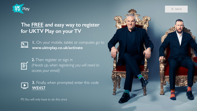
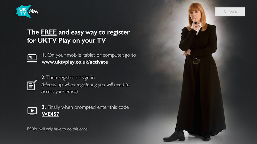
UKTV chose the most popular route, discarded the others and approached the interface in a different way. As you can see from the revised channel-flavored designs we simplified the language, added pointers to help users understand what to do, and shifted any wording that wasn’t instructional to the related web component.
What we learnt
When developing something new or unfamiliar it’s incredibly useful to conduct formal user testing: you never know what insights you’ll get out of it, and it will result in a better experience.
However, before doing anything, think very carefully about the range of users and develop a series of ‘personas’. It helps the design and UX teams to picture viewers when creating interfaces as well as recruiting testers. Give them names, occupations, hobbies and income so they become real, and continuously ask yourself how each persona might react to the interface.
Analyze what competitors are doing to build up an idea of how users may react. Gauge likely expectations, identify and use any common visual language and think about the ‘value exchange’ from the perspective of the user.
At each stage of the user journey try to eliminate any surprises and make sure you signpost key information with clear messages. Check and double-check that your language is consistent, we were guilty of interchanging ‘username’ with ‘email’ and ‘log in’ with ‘sign in’. Provide reassurance around sensitive things like data security and privacy by making transparent promises.
Finally, if things go wrong, make sure users know where to go to get the answer. Write up clear briefings for your user-facing teams in social and customer services so that they can provide good quality feedback. And build in a seamless bypass if your user management system goes down so that users can continue to watch videos.

