Marketers are always looking to new trends to give them an edge. While video certainly isn’t new to the scene, marketers are finding more and more ways to use it for a competitive edge. Whether its used for live streaming events, announcing product releases via social, or even training videos on the enterprise intranet, video is ubiquitous and its positive impact on your business only stands to grow.
As a digital campaign manager, I am always thinking: optimize, optimize, optimize. There are mornings that I wake up recalling how I dreamt about optimizing our content, our banner ads, and our nurture campaigns. Some of us eat, sleep, and drink our profession. Am I right?
The performance of a landing page can be tricky. This is yet another challenge I take on. Any optimization project always starts with a lot of questions. Sometimes that means just deciding how you’ll test a landing page’s success. Could it be time spent on page? Amount of clicks? Conversions? Video views? Number of return visitors? There are many different elements that one could use to track success metrics but, at the end of the day, most of us (myself included) base our success on conversions, i.e. form fills.
Let’s talk about some of the ways that we have tested our landing page elements and the outcomes.
Adding a Video Teaser on Landing Pages
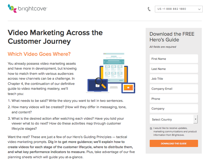
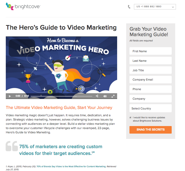
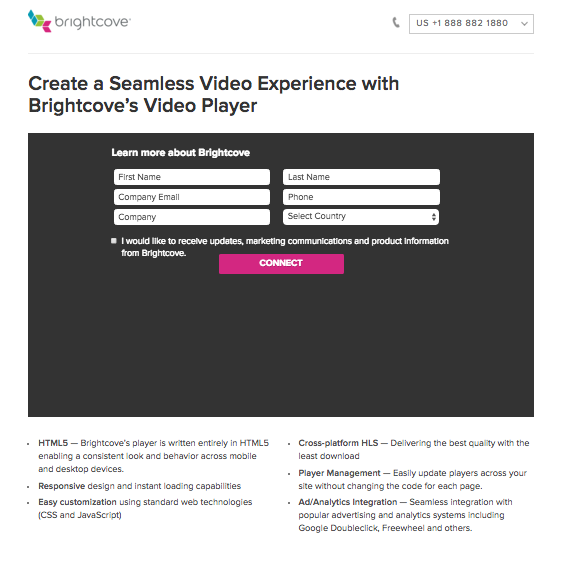
We recently did a test by adding a video teaser on our landing page before form submission. We thought that this could be risky because people would watch the video and forget to submit the form. But this wasn’t the case. Below you will see the two landing pages that we tested in our SEM channel. Both landing pages had about the same larger volume of impressions, but the video landing page was the clear winner.
This landing page had a higher click through rate by only about .1% but the conversion rate was remarkable. As shown below, the video focused landing page had about a 4% conversion rate as opposed to a 1% conversion rate with the landing page to the right.
Through testing, we have found that video on landing pages is effective and lifts conversion rates.
Reducing the Length of Page Copy
This might seem like an obvious one, but how much copy you have on your landing page can really affect the success of your conversion rates. If you’re marketing to marketers like I am, you recognize that our audience is a multi-tasking, easily distracted group! But really, everyone is short on time! We don’t have the time to read a page full of marketing-heavy copy BEFORE the form and BEFORE the actual asset. In the above examples where we also tested video, we also decreased the copy of the landing page. Since we couldn't be sure that this wasn't affected by our use of video, we tested some more. (Optimize, optimize, optimize!) We've decreased text on multiple campaigns like email and banner ads. We've found this to be extremely effective thus far.
Altering CTA Buttons Language
Our marketing team, and probably yours too, is always looking for ways to spin campaign copy from dull and data driven to witty and clever. Themes and trends are often incorporated into strategy but we found we needed to stick to CTA best practices, keeping the copy short and to the point. We tested several different types, here are a couple of examples:
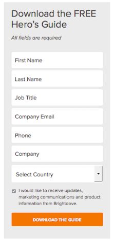
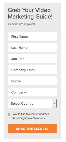
Download the Guide vs. Snag the Secrets Download the Guide saw a conversion rate of 2.5% where the wittier CTA saw a conversion rate of 2.2%.
Read the Report vs. Download the Whitepaper. Read the report saw a conversion rate of 3% where download the whitepaper had a 6% conversion.
Shifting Placement of Video Lead Forms: In-video vs Right-Hand
We recently tested a standard form vs landing page with an in-video form. After all, it’s video, it’s what we do! The Brightcove player gives the ability to place a lead form in the beginning, middle, and end of a video. We tested a teaser video on a landing page with a form on the right side of the page, like below and we also tested the teaser video with the form at the end of the video.
Within one month of this test, we had a clear winner. An in-video form is not as successful for short videos that are less than two minutes in duration. Interestingly enough, we have learned through multiple tests with in-video forms that people WILL fill out a form if the video is at least 20 minutes. Full demo videos, conference sessions, documentaries warrant an in-video form. When people are paying to see or attend a session or are receiving educational content then they will take that extra step to fill out a form. But for a one minute video teaser, this is not the best practice, so keep the form to a side bar.
So, what are the key take aways in optimizing your landing page?
- Use video teasers to draw interest and communicate more information in limited space
- Less is more -- Reduce the total page copy
- Place forms on the right-hand side for optimal results
- Keep things simple. Make your forms short and your CTAs in direct, conventional language.


